

Contrast in art is a powerful tool that artists use to create visual interest and convey meaning. By juxtaposing different elements such as light and dark, colors, or textures, they can draw the viewer’s attention and evoke emotions. This dynamic interplay not only enhances the aesthetic appeal but also helps to communicate deeper concepts and narratives within the artwork.
Understanding contrast is essential for anyone looking to appreciate or create art. It goes beyond mere differences; it’s about how these differences interact and influence one another. Whether it’s a bold splash of color against a muted background or the stark shadows cast by a sculptural form, contrast plays a crucial role in shaping an artist’s message and the viewer’s experience. Exploring this concept opens up a richer understanding of artistic expression.
Understanding Contrast in Art
Contrast serves as a fundamental concept in art, playing a crucial role in enhancing visual engagement and delivering deeper meanings. Artists exploit the differences between elements to capture attention and invoke emotional responses.
Definition of Contrast
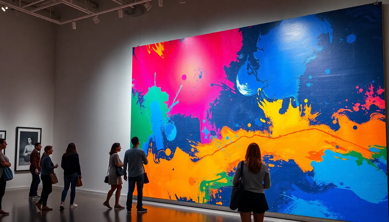
Contrast refers to the distinction between different elements within an artwork. It encompasses the interplay of opposing features, such as light versus dark and warm versus cool colors. This juxtaposition can highlight specific aspects, directing viewers’ focus and enhancing comprehension of the piece’s overall theme.
Types of Contrast
- Color Contrast: The use of differing colors to create visual tension. For example, a vibrant red against a muted green draws viewers’ eyes and emphasizes key areas.
- Value Contrast: The variance between light and dark shades, which can establish depth and highlight forms. For instance, a bright object against a dark background can enhance visibility.
- Textural Contrast: The combination of varied textures, such as smooth versus rough surfaces, creates dynamic interest. An artwork displaying slick paint against coarse materials invites tactile exploration.
- Shape Contrast: The juxtaposition of geometric versus organic shapes can create balance or tension within a composition. Utilizing sharp angles alongside soft curves directs viewer engagement in specific areas.
- Temperature Contrast: The use of warm colors juxtaposed with cool colors to evoke emotions. Warm colors like red or yellow can convey energy, while cool colors like blue or green may evoke calmness.
By exploring these types of contrast, artists can manipulate elements to communicate meanings effectively and guide viewers’ interpretations of their work.
The Importance of Contrast
Contrast plays a crucial role in art, enhancing the overall aesthetic appeal and emotional impact. Artists utilize various types of contrast to draw attention and convey messages effectively.
Enhancing Visual Interest
Contrast enhances visual interest by creating tension and excitement within artworks. Color contrast captures attention by juxtaposing vibrant hues against muted tones, while value contrast establishes a dynamic interplay of light and shadow. Texture contrast invites tactile engagement, making surfaces feel more inviting and lively. By incorporating these contrasts, artists ensure that their works remain captivating and engaging for viewers, prompting a closer examination of each piece.
Creating Focal Points
Contrast aids in creating focal points within an artwork, guiding viewers’ eyes to the most important elements. High contrast areas, such as bright colors against dark backgrounds, naturally draw attention, making them ideal for key components like subjects or specific details. Artists strategically place these focal points to emphasize main themes or convey emotions, ensuring that the intended message resonates clearly. By leveraging contrast effectively, artists shape the narrative flow within their compositions, leading to a more impactful visual experience.
Techniques to Achieve Contrast
Artists employ various techniques to achieve contrast within their works, significantly enhancing visual impact and emotional engagement. Key methods include color contrast and textural contrast.
Color Contrast
Color contrast involves placing different colors adjacent to each other to create tension and vibrancy. Complementary colors, like blue and orange or red and green, produce striking contrasts and draw attention. Artists often manipulate values by using light and dark shades of the same hue to establish depth. Additionally, utilizing saturated colors alongside muted tones creates visual interest, allowing certain elements to stand out and capture the viewer’s gaze.
Textural Contrast
Textural contrast highlights differences in surface qualities among elements in an artwork. For instance, combining smooth areas with rough textures invites tactile exploration, making the piece more engaging. Artists achieve this contrast by using various materials, such as thick paint, fabric, or even found objects, to create distinct surfaces. Thus, textural contrast not only enhances visual appeal but also adds complexity to an artwork, encouraging viewers to explore and interpret the piece more deeply.
Examples of Contrast in Famous Works
Contrast manifests vividly in a variety of renowned artworks, showcasing how artists effectively use contrasting elements to enhance visual storytelling and emotional resonance. This section explores specific examples that illustrate the principle of contrast in art.
Iconic Paintings
- “The Night Watch” by Rembrandt: This 1642 masterpiece employs value contrast to highlight figures against a dark background. The use of light draws attention to key characters, enhancing the sense of depth and drama.
- “Starry Night” by Vincent van Gogh: Van Gogh’s 1889 painting exemplifies color contrast through the vibrant blues and yellows. The juxtaposition of the swirling night sky against the calm village evokes emotional intensity and movement.
- “Olympia” by Édouard Manet: In this 1863 artwork, Manet uses contrasting colors of flesh tones against dark fabric. The stark differences create tension and challenge traditional representations of women in art.
- “Composition VIII” by Wassily Kandinsky: This 1923 piece highlights shape contrast, with geometric forms in various colors engaging the viewer’s eye. The diverse shapes balance harmony and chaos, promoting dynamic movement throughout the composition.
Modern Art Interpretations
- “Black Square” by Kazimir Malevich: This 1915 work showcases extreme contrast by presenting a simple black square on a white background. The bold contrast invites contemplation about the nature of art and reality itself.
- “Campbell’s Soup Cans” by Andy Warhol: Warhol’s iconic series utilizes color contrast with vibrant, repetitive imagery. The bright colors contrast sharply with the mundane subject matter, creating commentary on consumer culture.
- “The Persistence of Memory” by Salvador Dalí: This 1931 painting employs both color and shape contrast. The melting clocks juxtapose organic forms against a surreal landscape, invoking themes of time and existence.
- “Composition II in Red, Blue, and Yellow” by Piet Mondrian: Mondrian’s work from 1929 uses color contrast effectively through primary colors set against white space. The simplicity of the composition enhances visual impact, emphasizing balance and order in abstraction.
Contrast serves as a fundamental element in the realm of art. It not only enhances visual appeal but also deepens emotional resonance. By skillfully manipulating contrasts in color, texture, and shape, artists can create dynamic compositions that captivate viewers and convey profound messages.
Understanding the various types of contrast empowers both artists and art enthusiasts to appreciate the intricate layers of meaning within a piece. As artists continue to explore and innovate with contrast, they push the boundaries of visual storytelling, inviting audiences to engage with art on a more intimate level. The power of contrast lies in its ability to transform ordinary scenes into extraordinary experiences, making it an essential aspect of artistic expression.